DRMA
Art Direction
Photography
Website
Visual Identity
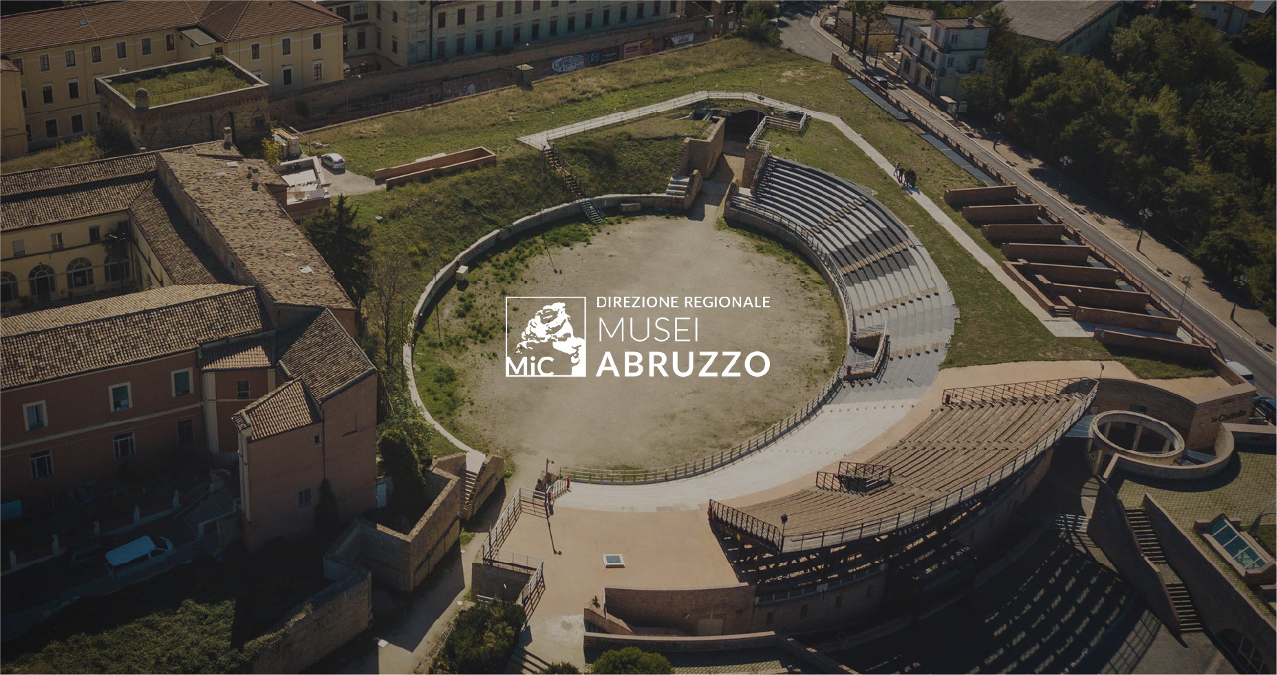
Direzione Regionale Musei d’Abruzzo is an organization that connects national and local institutions, public and private museums to build a regional museum system.
Its goal is to promote the cultural heritage of Abruzzo's national museums. It coordinates human, technological, and financial resources to organize high-quality cultural activities, exhibitions, hospitality, and educational services. Furthermore, it supports local networks that involve different stakeholders in the development of cultural itineraries.
Brand Identity
The biggest challenge was to develop a comprehensive project and create a new brand identity for Direzione Regionale Musei Abruzzo (DRMA) that was simultaneously innovative, visually appealing, and in line with the needs and values of a public administration institution.
Seven museums, five archaeological sites, eight churches, one identity.
Logo
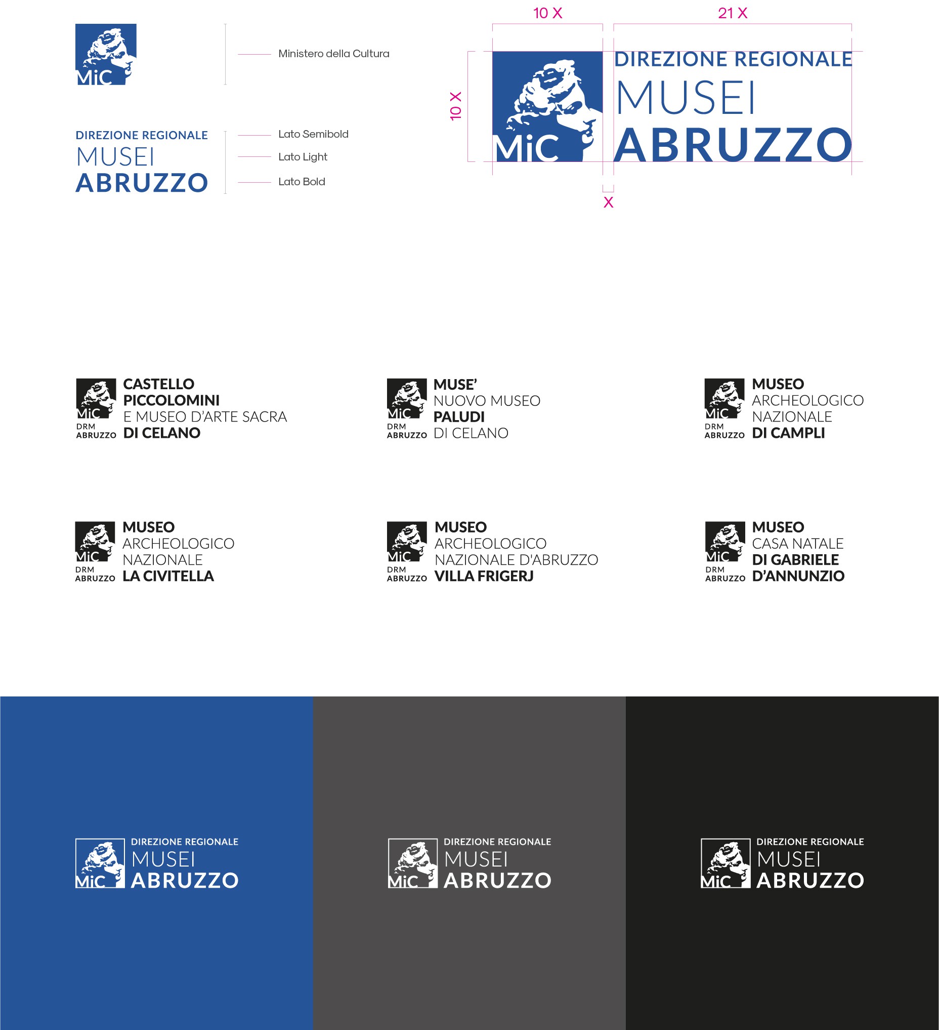
Our goal was to retain DRMA's institutional nature and its strong connection with MIC(Ministry of Culture). The only difference from the old logo is the font (Lato), the grid, and the sizes and weights balance in the name, which allowed us to enhance the brand's visibility and its connection to the territory.
Subsequently, we created six logos for the six museums belonging to DRMA, which, until that moment, either didn't exist or were completely different from one another. We chose to incorporate the DRMA logo into a vertical pictogram with a variable section containing the names of the museums
Color Palette
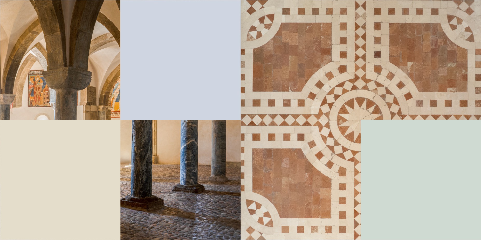
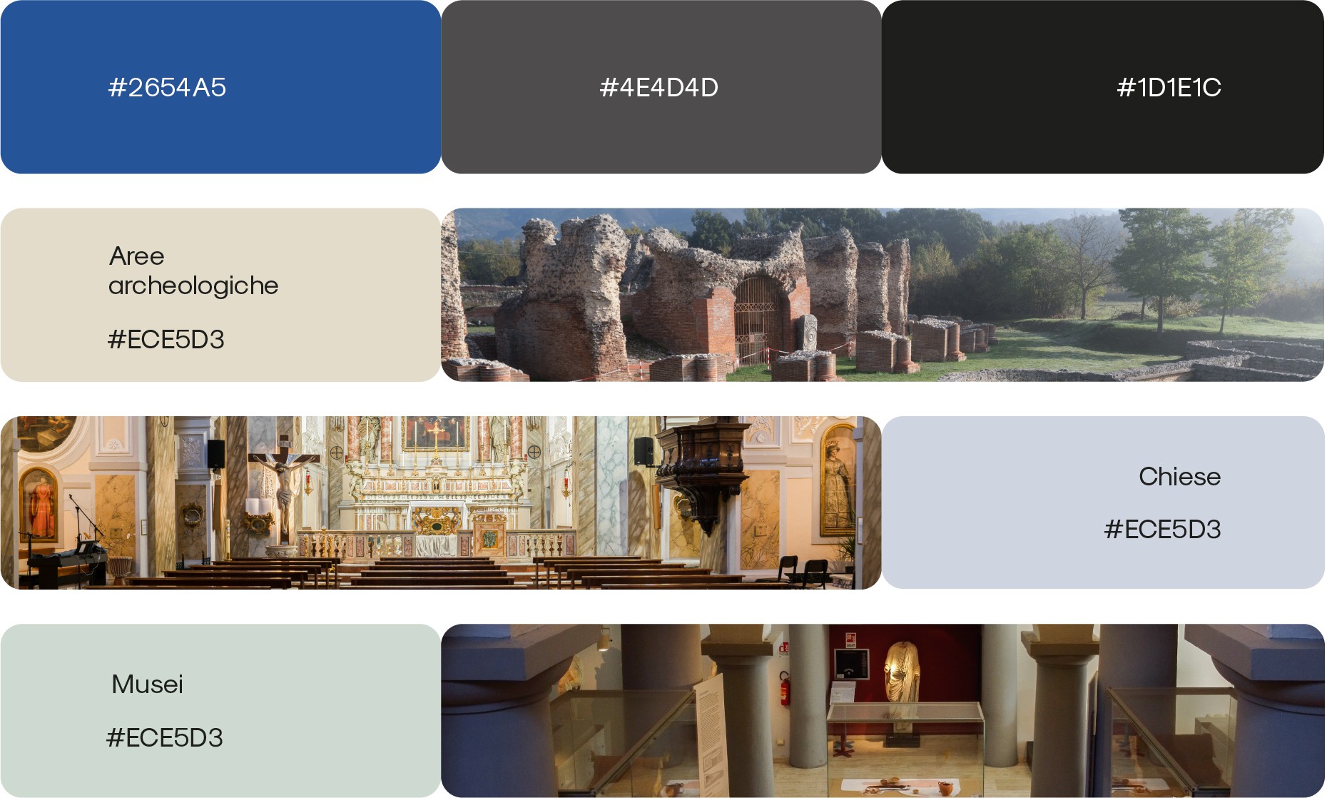
The institutional color palette was supplemented with a secondary palette dedicated to the communication of the 20 cultural sites. We selected three colors representing three macro-categories of the sites: Museums, Churches, and Archaeological Sites. The pastel tones convey an elegant attitude and are soft enough to enhance the artistic and cultural beauty of the region. Furthermore, the colors match the natural characteristics of the territory: blue like the sea, green like the mountains, and beige like the cultural sites.
Fonts
We used two fonts: Sk-Modernist, a modern font with excellent readability perfect for the body text, and Neue Metana, a geometric font for titles and subtitles.

Illustrations
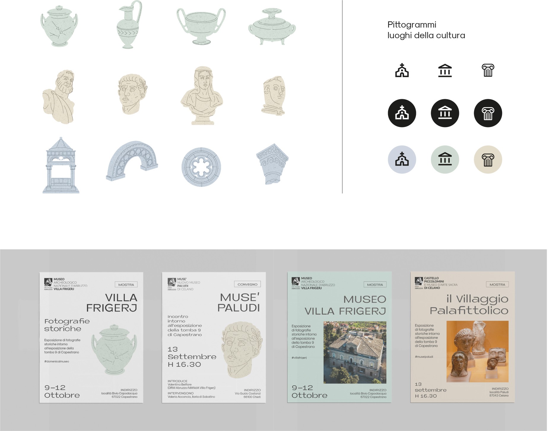
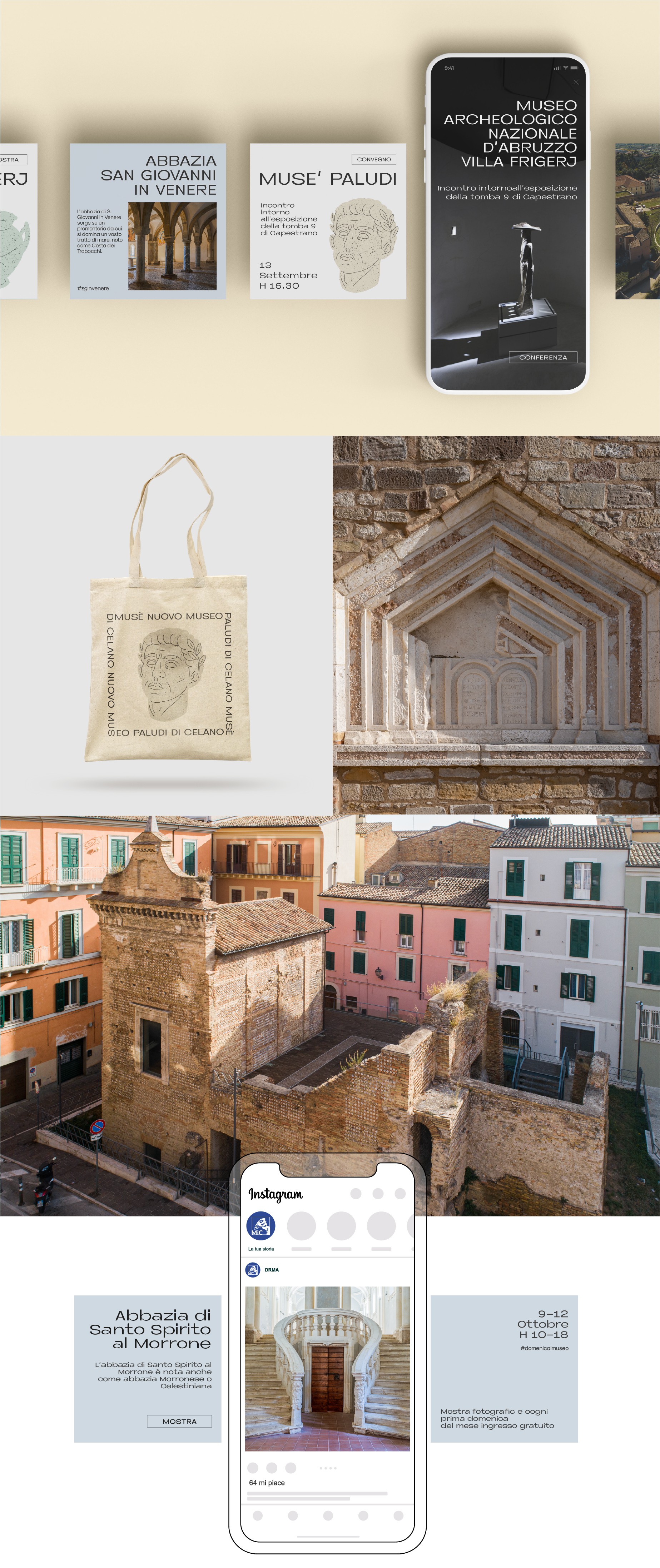
We designed an illustration set featuring vases, statues, and architectural elements inspired by the real elements decorating the cultural sites to enrich digital communication with a personal touch.
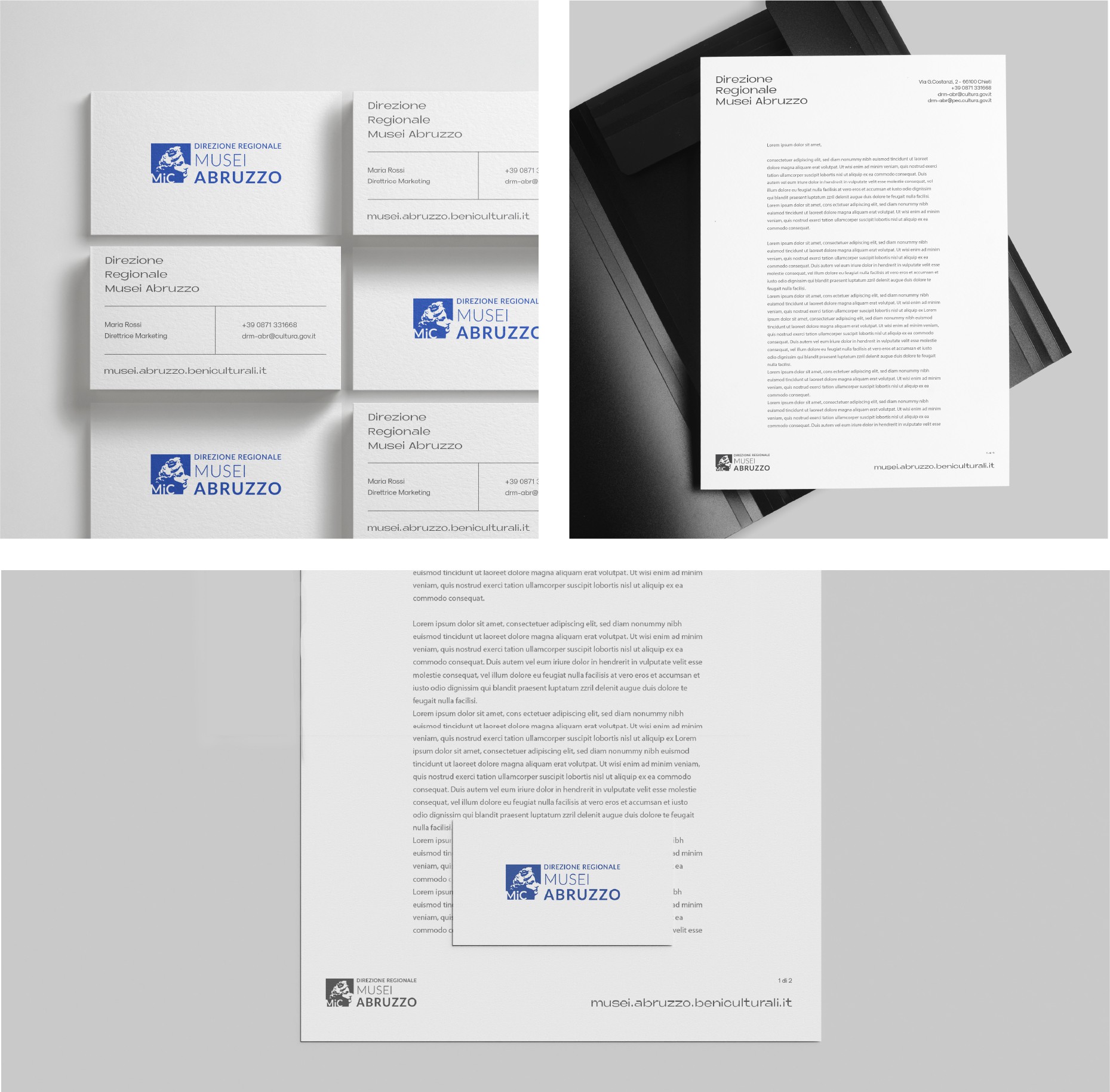
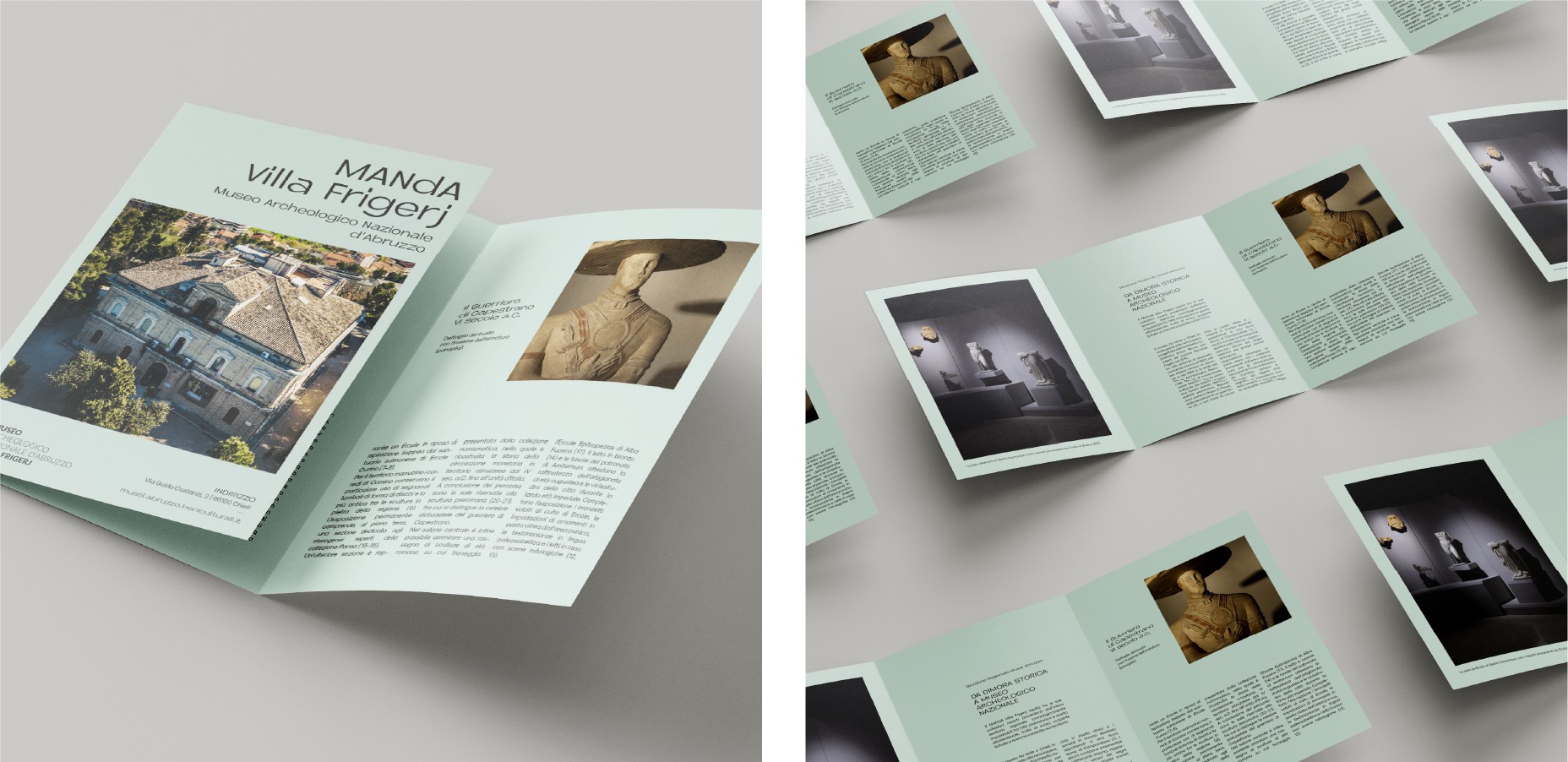
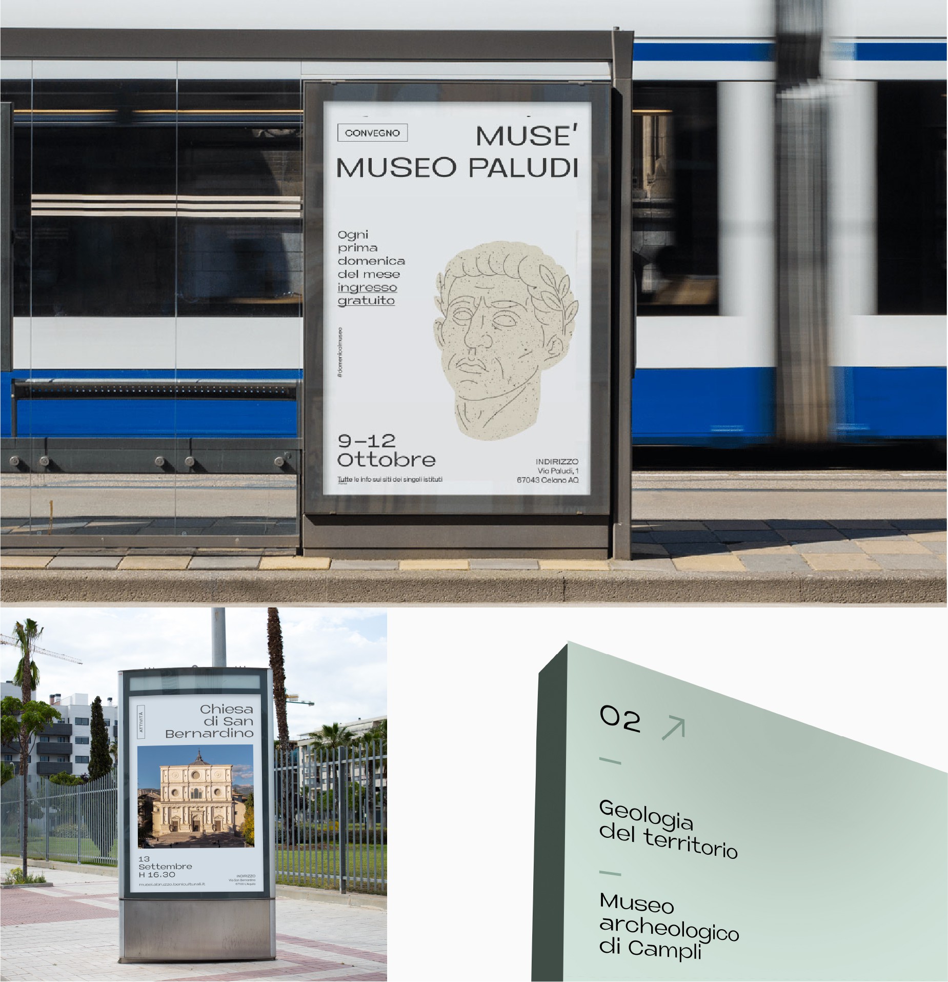
Based on the new look and feel, we developed printed materials such as brochures, OOH boards, etc. Here, the secondary color palette was used as the primary color. We also worked on some Gadget and Merchandising proposals, incorporating brand elements to increase brand awareness.
Wayfinding Elements
We redesigned the internal maps and the wayfinding system for all the museums and other cultural sites to enhance the user experience.
Website
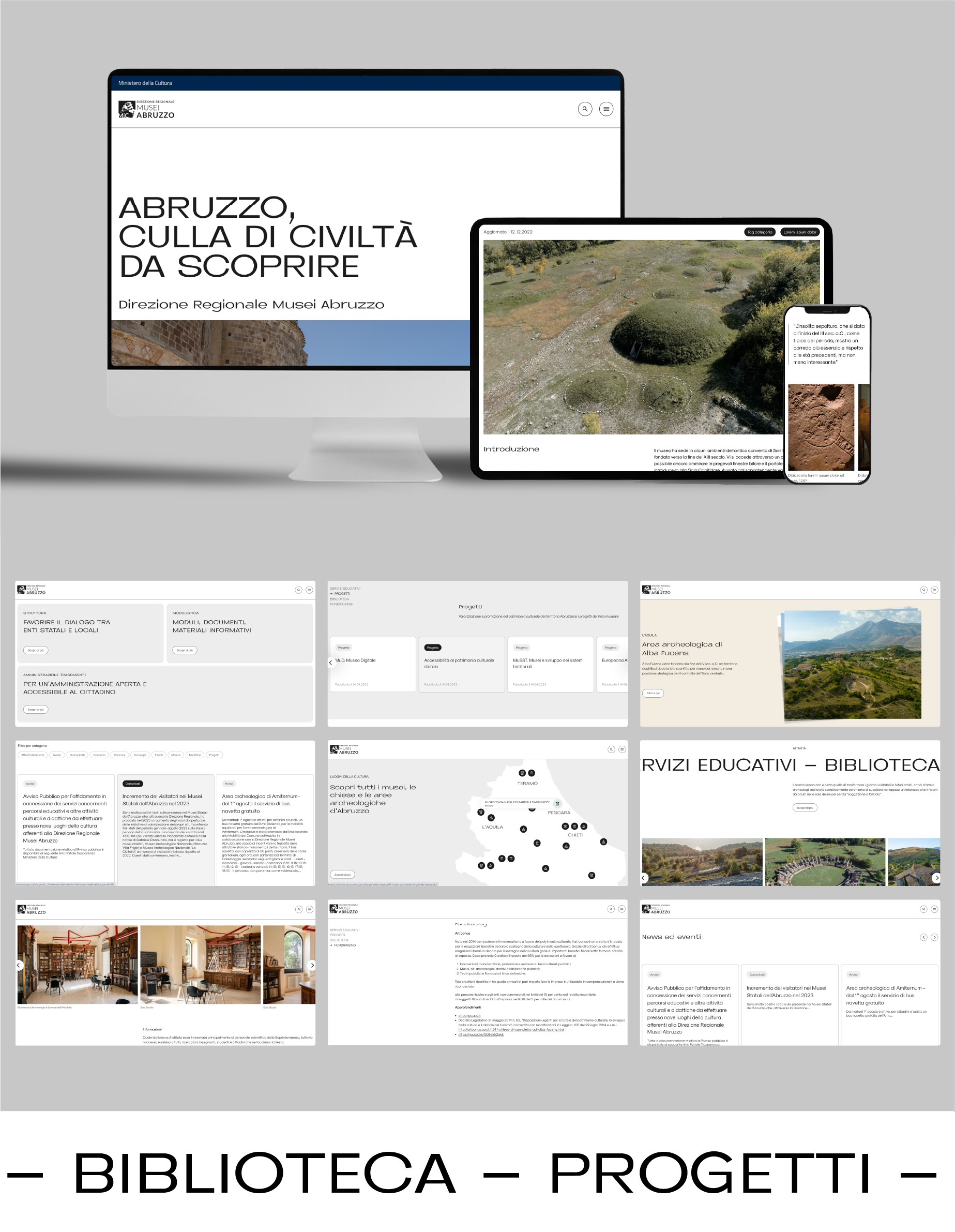
The new website has a completely new interface with a minimalist style and a modern responsive layout. Navigating the website should be an easy, pleasant, and seamless experience for everyone on both desktop and mobile systems.
The new pictures and videos are the main features of a website that aims to be a reference point for all tourists willing to visit the magical cultural sites of the Abruzzo region.
Content and Social Media
In line with DRMA's aim to boost tourist visits, we created videos capturing the cultural sites' beauty and natural surroundings. These videos, alongside a photoshoot featured in an MIC-backed editorial project, convey the unique narrative of humanity's connection with nature across eras. To ensure brand consistency and communicate DRMA's holistic approach, we crafted a versatile social media strategy. Providing source files and Canva templates for Instagram and Facebook posts and stories, we introduced a labeling system categorizing recurring communication topics based on micro and macro themes.
HEAD OF PROJECT ← GIOVANNI CARFORA
EXECUTIVE ACCOUNT ← TOMMASO ACETI
ART DIRECTION ← ADRIANA TASSI
HEAD OF DESIGN ← VINCENZO ALFIDI
UX/UI DESIGN ← MATTEO GIAMPETRUZZI
FILMAKER & PHOTOGRAPHER ← TOMMASO CARFORA
CTO ← DANIELE DE SANTIS
SENIOR DEVELOPER ← FRANCESCO LORENZETTI
MOTION DESIGNER ← GIORGIA GENOVESE
ILLUSTRATIONS ← ELEONORA INVERNIZZI VERTOVA